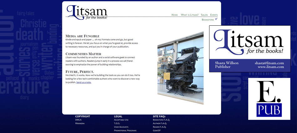
Litsam is my publishing company. The freedom to do anything I want with the design has proven frustrating at times, but these early designs were the first to demonstrate the emerging corporate concept: ink blue, clean lines, clean typography.
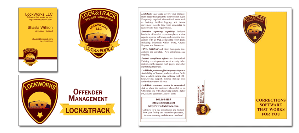
LockWorks Collateral
Lockworks had an outdated logo that used a low-resolution image of the Alamo. They wanted to keep the image but update the logo and collateral materials to reflect their focus on jail management software. I created this shield logo and then built related materials for their products and corporate image.
Another old-timer
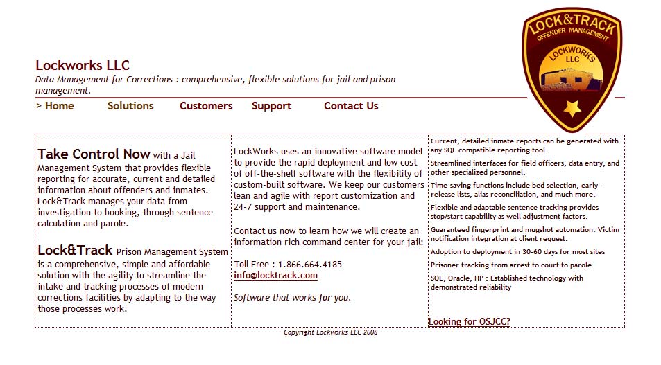
Take a look at that copyright — 2008. That’s the last time I *updated* the web site. It was designed in 2005, quickly and on the side while performing my primary duties as a Java programmer on an OpenVMS system.
My sites last. Fashions change, and there’s no doubt these older sites need both a facelift and updated SEO features, but I’m proud of the way my sites age gracefully. This one even features a responsive design (adapts to a smaller screen) which wasn’t “a thing” when I built it.
During my years of design I’ve found that keeping it simple and accessible leads to designs that age well.
A blast from … 1996!
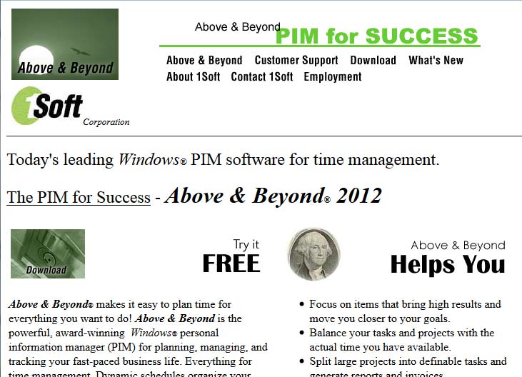
Why do I have an outdated web site posted in my portfolio? Because I built this web site in 1996 and it’s still online in 2021! In the intervening decades virtually all of the technology has evolved, but because I built the site to high standards, most of it still works. Image maps? Haven’t built one of those in a decade or more. Tables for layout? How embarrassing! Javascript rollovers? These are…dated.
I don’t know another designer who has a web site old enough to drink, and while I certainly wouldn’t design it now, I’m proud of the fact it works. I’m still using the same philosophy I used then: keep it simple and clean, focus on accessibility and cross-browser compatibility, and you’ll have a robust resilient site.
I just never expected to have one that was nearly old enough to vote!


